Non-Project Related Work Management Made Easier


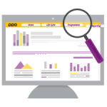
PPO’s Main Menu allows you to navigate quickly to pages within PPO. Even though the existing main menu in PPO is already really good, the latest update will bring further enhancements that improve navigation.
An avatar, also known as a profile picture is typically applied to social media profiles and software apps. So much of our interactions are taking place online these days, which is why PPO is introducing avatars to allow users to express themselves personally.

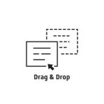
Over the years in training sessions with users, one question has been consistently asked when we get to the ins and outs of uploading and maintaining documents in PPO, “Can’t I just drag and drop my documents into PPO?”

PPO’s document entity provides users with the ability to upload documents of any format. This in turn makes collaboration on documents possible and provides the means to track compliance to governance which are both important features for all project environments. It also becomes a safe storage space where you and your project team can access a centralised project document repository from any device.

One of the most valued features of PPO is the ability to import tasks from Microsoft Project (MSP) or Excel into PPO’s task entity with a couple of clicks. This ensures that Project Managers are not expected to give up their favorite planning tools when using PPO, the integration works smoothly, however there has been one drawback – PPO did not delete tasks that have been deleted in Microsoft Project (MSP) or Excel.

Visitors to the Project Portfolio Office web site may already be familiar with our purple Live Chat bubble, lower right hand corner of their screens, but for those of you that haven’t, don’t fret, we are introducing our Live Chat directly in PPO!

Traditionally when a team member leaves a project before it is completed it’s a pain! Over and above a change to the project team dynamics and relationships, just trying to get a handle on what the team member is involved with, the background and history of each item, the next steps and accessing any documentation is often a time-consuming activity.

Hot on the heels of our fancy new filter control on list pages, we are pleased to introduce our latest change. PPO is saying goodbye to the action icons and replacing them with action buttons and action menus.