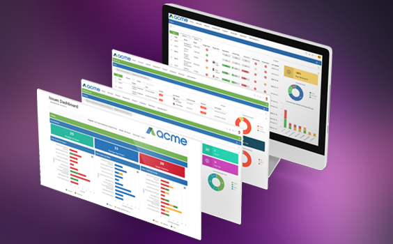
Category: Product News

Copy a Single Item from Entity View Pages!

Illustration of three stacked papers; the top sheet is white with grey lines, the middle sheet is yellow, and the bottom sheet is purple. The top page has a folded top-right corner.

Ever wanted to copy a project because you’re doing the same project at two different sites or wanted to copy a risk because you have a similar risk on your project? Now you can!

Working with the “My Lists” Widget!

Illustration of a checklist on a piece of paper with three yellow checkboxes and lines representing text next to each box, and a folded bottom-right corner.

The “My List” widget is a new widget visible from the Home Page. It allows users to create their own lists to keep track of priority items or simply a way to keep focus items in a single list which can be added directly from the Home Page.

Introducing the Calendar & My List Widgets!

Illustration of a computer monitor displaying web development elements, surrounded by icons such as gears, a light bulb, globe, code, envelopes, ruler, pencil, and image thumbnails, representing digital and web design concepts.

We’ve supercharged your Home Page and added the Calendar and the My List widgets to our growing list of new widgets (Chart, Key Metrics & Bar Chart)! We don’t typically deploy two significant features at the same time, but this had to be an exception to the rule!

The new Bar Chart Widget is now available on list pages!

Illustration of three vertical bar graphs, a rising arrow, and a pie chart divided into yellow and purple sections, representing data analysis and growth.

Since launching the Donut & Treemap Chart Widgets in 2022, we have made several improvements to the functionality including the Key Metric Widget and the ability to filter and add charts using RAG fields. We have made another improvement to allow you to add Bar Charts to your list pages!

User Group or All User Tagging Available!

Three overlapping chat bubbles: one gray, one yellow, and one purple, each with three dots inside, symbolizing conversations or messages. The background is light gray.

We have improved the Conversations functionality to make your day-to-day tagging and collaboration even better! We have added the ability to tag multiple users by either tagging @All users or tagging all users that belong to a specific @UserGroup!

Catch Up on PPO’s most recent smaller but helpful enhancements

Illustration of a smiling man in a suit and a woman in business attire surrounded by business icons, such as graphs, gears, a calendar, envelope, lightbulb, and speech bubbles.

Catch Up on PPO’s most recent smaller but helpful enhancements that will improve your PPO experience. In the spirit of simpler, better and faster, we’ve got some new enhancements to user groups, public holidays, BI API, filters, viewing feed items on mobile devices and more….

Introducing hyperlinks for Conversations!

A computer monitor displays gears, a clock, and icons for search, chat, and mobile. Arrows and dotted lines connect the elements, suggesting communication or workflow. Color swatches are below the monitor.

Since launching Conversations in 2022 we have made several improvements including adding the notification count and alerts, adding conversations to Time Entries, Marking Items as Unread and Automated Emails for Unread Feed Items.
Good news! We have made another improvement by allowing you to add a hyperlink to your conversations!

Introducing Colour Coding on Key Metrics!

A computer monitor displays colorful data visualizations, including pie charts, bar graphs, and line graphs in purple, yellow, and orange tones. Three circular charts are shown above the screen. Gears and a globe are in the background.

With the introduction of the Key Metric Widget we promised additional improvements and asked you to keep sending us your ideas. Good news! We have delivered on this promise! You can now apply different colours to your Key Metrics based on certain conditions or ranges.

Missed the What’s new in PPO webinar? Watch the recording…

A smiling man in a suit is centered among four squares, each showing different project management method icons: Scrum, Scrumban, Waterfall, and Kanban, on purple and yellow backgrounds.

While we’re being honest, our DevOps team loves the excitement of bringing our clients new features, but the real reward is in seeing our users adopt new ways of work and improve collaboration within their PMOs. And that’s where the PPO Product Webinars come in. Whether you’re just getting started with PPO, or you’re a seasoned user, there’s always something new to discover and ways to improve! So make sure that you’ve “saved the date” for this year’s remaining product webinars.