Author: Lindi Gerber
Lindi, as the Support Manager at PPO, is the heartbeat of the PPO support desk and the sensei to her support ninjas. Lindi loves spending time with her family, catching up on series, shopping , and she is a true wine aficionado.
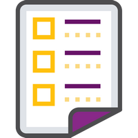
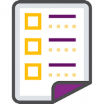
The “My List” widget is a new widget visible from the Home Page. It allows users to create their own lists to keep track of priority items or simply a way to keep focus items in a single list which can be added directly from the Home Page.
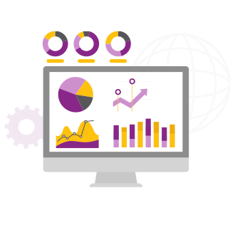
We’ve supercharged your Home Page and added the Calendar and the My List widgets to our growing list of new widgets (Chart, Key Metrics & Bar Chart)! We don’t typically deploy two significant features at the same time, but this had to be an exception to the rule!
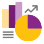
Since launching the Donut & Treemap Chart Widgets in 2022, we have made several improvements to the functionality including the Key Metric Widget and the ability to filter and add charts using RAG fields. We have made another improvement to allow you to add Bar Charts to your list pages!

We have improved the Conversations functionality to make your day-to-day tagging and collaboration even better! We have added the ability to tag multiple users by either tagging @All users or tagging all users that belong to a specific @UserGroup!
Since launching Conversations in 2022 we have made several improvements including adding the notification count and alerts, adding conversations to Time Entries, Marking Items as Unread and Automated Emails for Unread Feed Items.
Good news! We have made another improvement by allowing you to add a hyperlink to your conversations!
With the introduction of the Key Metric Widget we promised additional improvements and asked you to keep sending us your ideas. Good news! We have delivered on this promise! You can now apply different colours to your Key Metrics based on certain conditions or ranges.
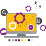
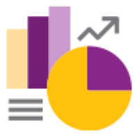
Our widget journey continues with the introduction of the interactive donut and tree map chart widgets. These new widgets make it easier for users to visualise their data in the list with less clicks. You’ll of course still have access to dashboards for graphical representation of your data. Check out this short video aimed at PPO users that covers how to set up these widgets on list pages and restore default settings.
We’re Hiring! PPO is looking for a customer-focused, detail-oriented technical support consultant to provide first and second tier user support to clients and partners. This position is by no means a boring helpdesk role, but instead is a highly consultative support role that requires you to apply your business analysis skills.
Traditionally when a team member leaves a project before it is completed it’s a pain! Over and above a change to the project team dynamics and relationships, just trying to get a handle on what the team member is involved with, the background and history of each item, the next steps and accessing any documentation is often a time-consuming activity.