PPO’s dashboards have made use of a 3rd party component since we initially developed the first version of the product. Two years ago, we started the journey of improving the visualisation of the PPO data and worked on several enhancements to support this. One of the key enhancements was the swopping out of the 3rd party component that PPO had used to a new tool that gives PPO’s dashboards a major upgrade. Today, we have deployed the new PPO dashboards, with the improved chart component.
This is a significant change in that PPO’s dashboards now allow for the following:
- Enhanced look and feel, similar to what you’ve already experienced with the deployments of chart widgets;
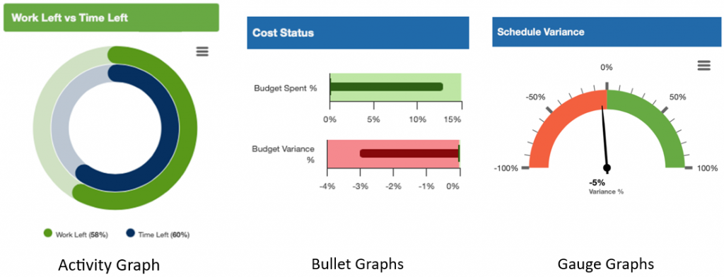
- The inclusion of new graph types:
- Activity Graphs
- Bullet Graphs
- Gauge Graphs
- The ability to support drill down from charts;
- The ability to support click through from charts;
- The ability to zoom into timeline charts;
- The ability to include and exclude specific data from charts;
- Inclusion of PPO’s Key Metric Widget into Dashboards; and
- The ability to see any chart in full screen mode;
- The ability for users to include Data Table for charts;
- The ability to download the data that makes up a Chart into CSV file; and
- The ability to download the Chart into PDF and PNG formats.
You will immediately notice that your instance of PPO has the new look and feel of the charts for all standard and customised dashboards with the standard functionality list above. The additional functionality related to the drill downs, click throughs and new graph types will be deployed for clients via the success managers in the coming weeks.
The new component also allows us improved reporting for the Gantt charts within PPO’s dashboard section, and these changes will also be deployed for clients via the success managers in the coming weeks.
Here are some examples of the new features available to users:
New Graph Types
Drill Down
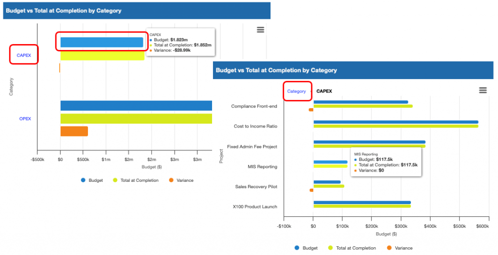
The drill-down ability allows users to drill down on a caption or any part of the chart and see more detail, in the same screen, and then navigate back to the starting chart.
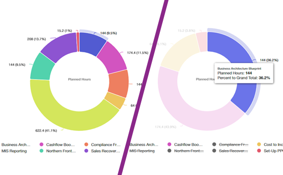
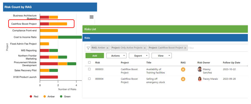
Click Through
The click-through ability allows users to click on a caption of any part of the chart and drill into the specific records for that specific entity:
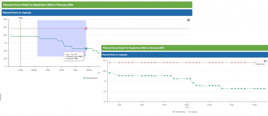
Zooming
The zooming ability allows users to select a portion of a line or timeline graph and zoom into a specific period:
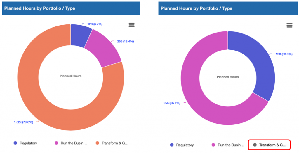
Include & Exclude Chart Data
The include and exclude chart data ability allows users to exclude specific values from the graph, without having to refresh or change dashboard filters. This is the same functionality that’s available to users on the chart widgets.
Key Metrics Widgets
The key metric widgets that users have been used to using on the list pages, is now incorporated into the dashboards, with the ability to jump to the underlying detail.
If you experience any challenges or have any questions relating to this change, please feel free to log a support ticket.
More importantly we will be releasing some exciting new standard dashboards before the end of the year so to keep up to date with these please subscribe to our blog and join our quarterly product webinars.
If there is something else, you’d like to see on PPO dashboards, please don’t forget to let us know if you have any other product enhancement ideas! Drop us an email or log an idea on our community portal please.