We are pleased to introduce our new more colourful percentage fields as well as colour coded custom list items.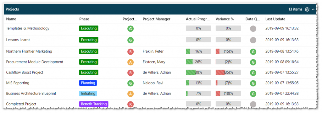
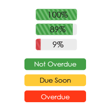
All percentage fields now show a graphical representation of the percentage with positive percentages showing in green and negative percentages in red. The absolute value is also highlighted by showing it as a “progress bar”, allowing you to identify items requiring attention at a glance.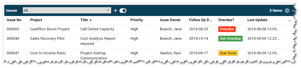
Clearly identify important work and critical points using colour to highlight project phase, issue overdue status, risk overdue status, work item status and so much more. Users will now know where work on a task, project or portfolio stands at a glance.
Ready to add colour to your custom list fields? If you’re a PPO Admin, you can start using the new colour coded custom lists today. If you need help with configuring colour coded custom list values, check out the Knowledge Base.
Stay tuned for more updates soon—today’s feature update is one of many for our user interface facelift initiative. We’d love to hear how you’re using our awesome new features. Share with us in the comments!