In Part 1 of this two-part series, we discussed the what, the why and the how of Data Quality. We are now going to expand on that by giving you examples of metrics and monitoring that have been implemented by our clients on their Data Quality journey.
The monitoring dashboard in PPO is a great tool to use to evolve your Data Quality metrics. The standard Monitoring Dashboard already provides some of the basic metrics to ensure that your users are logging in and updating PPO as required. We can help you take this further and tailor the metrics to support the monitoring that you would like to do.
Why/when would we need this?
- Implementing or re-implementing PPO
- Adding new capabilities to the PMO and measuring their adoption
- Changes to current ways of work or processes that need to be implemented in the tool
- As part of your PMO’s maturity journey.
What can you show me that I haven’t seen yet?
Let’s look at some examples of how PPO has evolved metrics to meet our client’s needs:
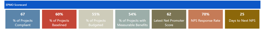
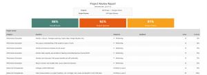
PMO Scorecard
In the key statistics below you can see at a glance how the PMO is doing. In this instance the enterprise project management office (EPMO) is measuring the portfolio in terms of baselined projects, budgets and measurable benefits. They are also using Net Promoter Scores to measure the organisation’s assessment of their effectiveness.
Data Quality
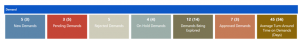
Starting with the basics, monitoring comes standard with a base Data Quality metric that determines whether or not the Project Manager has updated ALL their Health Indicators and comments on a set reporting frequency (7 days). It is only measured for the Active Portfolio.
To add a little flavour, we have also illustrated here how Data Quality can be split within the same monitoring dashboard for two different user types. This could also be split between different portfolios.
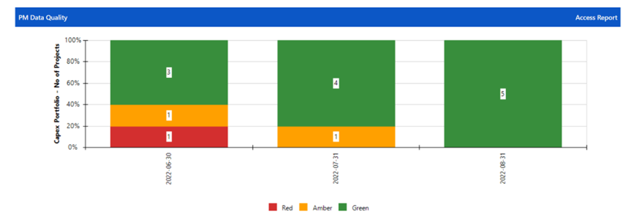
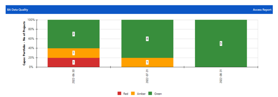
In the case of this client, the Project Managers and Business Analysts have different sets of Health Indicators and Comments that require updates, hence we split the Data Quality metrics between the two groups.
This could also work well where you have other resources such as Change Managers working on a project. Instead of the Project Manager updating on behalf of the Change Manager, it can come from the horse’s mouth so to speak. Responsibility for Data Quality can then fall to the right person.
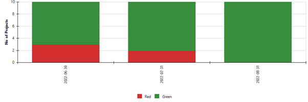
Projects with Schedules and Schedule Variance
Project schedules are the foundation of a project. Before using a tool like PPO, reporting on progress is often a graphic manipulated by the Project Manager to show where they are at and not from the source itself i.e. the schedule. This takes time and effort but when switching to a tool, it does often require a mind switch with the Project Managers that they need to keep their plans updated but also regularly import them into PPO. Sometimes getting that first plan into PPO takes a lot of coaxing… In these instances, we set up the monitoring to show how many projects have plans and how many don’t. One can access the Data Completeness report to determine which projects are not compliant.
With one of our large mining clients, we implemented PPO at a time where they had a massive programme that involved Stream Leads managing projects for their departments. These Stream Leads had little to no experience managing projects. You can imagine how intimidating it was for them creating schedules in MSP for starters and then being faced with a project management tool when they had no concept of the basics. In order to monitor that they were in fact getting their schedules into PPO we set up this metric. This wasn’t to be used as a stick but rather a means of identifying who needed help and additional training.
This can be evolved further to show whether a project has milestones in the schedule and a project task (where the Excel template is being used) has been added as this improves the quality of portfolio timeline reporting.
Number of Projects with Schedules
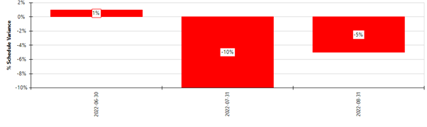
Once plans are in PPO it becomes important to monitor that they are kept up to date. We all know that to an extent projects in a portfolio may run a little behind on average but once that average is beyond tolerance we know that the schedules are not being updated which will be problematic for reporting on progress.
They have different Health Indicators and Dashboard Comments and use PPO very differently which meant we had to configure and monitor for the fact that one size does not fit all.
Portfolio % Schedule Variance
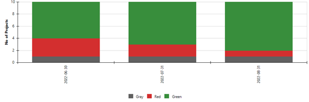
Projects with Budgets
We have come across instances where Project Managers were not used to managing their project budgets. The organisations in these cases were operating on a more reactive than proactive approach to projects. As maturity was starting to grow with a properly established PMO, they were given budgets for these projects and with that came cost management. PPO provides flexibility in how costs are captured and for a Project Manager new to managing a budget in more than a one-liner, this could be quite intimidating. Again – this is not about applying a stick but rather providing support and training. Identifying projects that do not have budgets in place by Execution is key. Monitoring of cost Data Quality was thus set up in the following way:
For projects that are in Idea, Initiation or Planning the costs are currently being developed and thus the methodology does not require project budgets. For these projects the indicator is Grey. All projects in Execution or beyond require a budget and Green indicates that the budget has been uploaded on PPO and exists (i.e. is not zero) and Red indicates that the project has no budget.
Number of Projects with Budgets
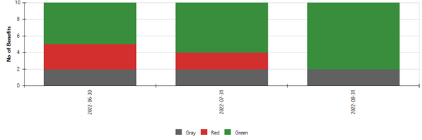
Projects with Measurable Benefits
When we started with PPO at this client, they had 94 projects and almost none of them had any defined benefits. An EPMO target was set to ensure that all projects had measurable benefits. Once a project has passed the planning phase, there is a RAG that measures whether the project has measurable benefits or not. Red = no benefits defined or captured on PPO Green = benefits are defined and captured on PPO, Grey = not required (again this is taking into account scenarios where different types of projects require different metrics).
Number of Projects with Measurable Benefits
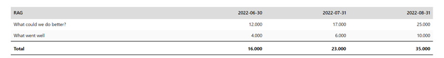
Cumulative Lessons Learnt
In order to drive knowledge management and maturity, we should be recording lessons learnt (what went well and what went badly) on an ongoing basis. This metric will look at the cumulative lessons learnt across the portfolio over time. It’s common for Project Managers to only record lessons learnt at closure, but this should be something done throughout the project.
Number of Lessons Learnt
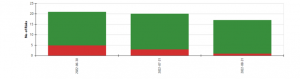
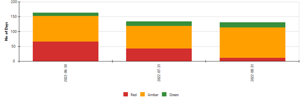
Overdue Risks / Actions / Issues / Decisions
This is a metric we use across RAID items, but we are only looking at risks in this example. Often with an implementation, we start off just with a count of risks loaded and what status they are in. Once the data load is done however, the PMO wants to be sure that these risks loaded on PPO are actually being updated and managed. We can also see by this graph that risks are being added and closed as the total number varies through the months.
Number of Risks per Status
Average Age of Risks
Recently a client asked that we start monitoring the average age of risks. The problem for the PMO was that although risk follow-up dates were being updated, the risks seemed to be living forever. At some point, they should either be accepted, mitigated or closed.
Average Age of Risks by Risk Rating
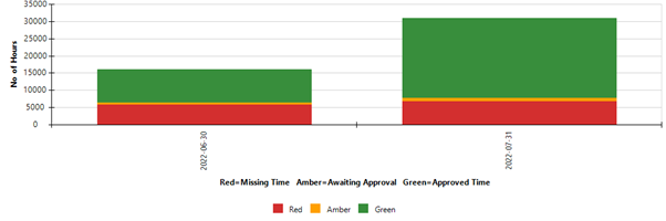
Timesheet Analysis
Whether moving from another timesheet system to PPO or implementing time sheets for the first time in your organisation, getting users in the habit of capturing and submitting time for approval can be a mammoth task. Understanding how much change management needs to be applied during this process is key.
When implementing timesheets it really is important that we analyse where the usage gap is. Is it the user not capturing time? Forgetting to submit for approval? Or is the bottle neck with the approver?
Timesheets carry a cost implication which is why it is imperative to make sure that the Data Quality of your timesheets is up to scratch. That way you can take action before it gets out of hand.
PPO does provide great timesheet dashboards to see further detail on the quality of the timesheet data.
Number of Hours per Approval Status
Demand Management
More and more of our clients are implementing a demand or idea entity in PPO. With our non-project entity we are able to give a space for capturing these and then once approved, web services are able to automatically create projects.
What is very important is keeping an eye on how the demands move through the process. If business finds that the PMO is lagging and these items are not being assessed and approved or rejected timeously, they will lose confidence.
Performance & Evaluation Reviews
Data Quality can be evolved into performance reviews for stakeholders in projects.
In this example we see that the Sponsor and Owner are scored on their performance in these roles on the project.
Basing reviews on metrics, the PMO could also measure the Project Manager’s performance with Data Quality being a measurable indicator of performance.
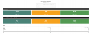
PMO Efficiency Review
Ultimately, the PMO is responsible for compliance to governance and good quality data. Metrics and scorecards can be used to measure the efficiency of the PMO in managing the portfolio. In this scenario, the PMO has targets to reach for each phase in terms of compliance to governance with size of project determining that target.
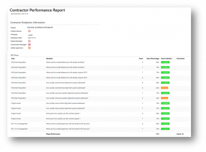
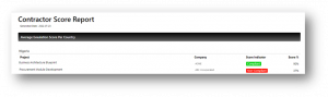
Vendor / Contractor Evaluation
Many project environments rely on vendors and contractors to perform and do what has been agreed on. In this scenario, PPO assisted a client in setting up an evaluation entity to keep track of contractors doing work on various projects. Again, if your Project Managers are contractors, using Data Quality metrics to review performance can aid you in selecting the best vendor for future projects. This can be taken down to the level of a particular person. Why is that important? In the world of contracting, people move around. You might have a good experience with a particular resource who then moves to a different consultancy. Knowing that this individual is a good fit for you from past experience may assist you in determining whether or not to use that vendor.
 These are just some examples of what we have done. These solutions came out of specific needs that clients have had. We would like to assist you in your monitoring needs. If you have seen something you like and would like to discuss it further, please contact PPO Support or chat to your Success Manager.