
Data Quality ensures that information on hand in PPO is up to date and relevant. It is a measure the PMO can use to ensure that reporting is thorough and regularly done. It is also a tool that the Project Manager can use to consistently manage their project professionally and according to the reporting standard of the project management office (PMO).
In this two-part series, we’ll explore what Data Quality is, why we do it and how PPO does it out-the-box. Part 2 will focus on how to improve Data Quality through additional metrics and monitoring that you can grow or fine tune to your specific needs.
In PPO, we have various means of monitoring the quality of the data so that the PMO can be confident that the information used in reporting is accurate, relevant and complete. In this article, we’ll explore the basic Data Quality measures and some additional metrics for the Project Manager and the PMO.
What is Data Quality?
The PPO standard uses a Data Quality RAG (Red, Amber, Green) indicator on the project that informs the Project Manager and PMO that the dashboard Comments and Health Indicators have all been updated within the agreed number of days. The default set-up works on a 7-day reporting cycle but can easily be configured to a 14-, 30- or 90-day cycle. PPO even allows this to be adapted for different types of projects or portfolios. For more information on standard PPO Data Quality, click here.
Data Quality isn’t something that must be set in stone and is often reviewed based on changes to the PMO scorecard, project and portfolio reporting requirements and organisational maturity. It can be evolved and nuanced for the particular needs of the organisation.
Why Do We Care About Data Quality?
A key requirement and typical service for every project environment is to have available on hand:
- Real time,
- Credible and
- Quality status reports for information and decision making.
There is no point in consuming the information and making decisions on information that is out-of-date or inaccurate.
Project and portfolio reporting is a vital governance practice for any project, why? Simply put – to keep project stakeholders engaged, improve decision-making and ultimately move strategic objectives forward.
Reporting should facilitate decision making, problem solving and keep the project moving forward in a positive direction.
- The information must be relevant, accurate and well-articulated
- The data is presented in a professional manner
- The timing is regular (the heartbeat)
For the standard PPO configuration, Data Quality is measured against the frequency of updates, but why?
This is where the reporting heartbeat comes in…
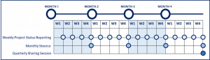
Think of a heartbeat – it is consistent in its timing – thus our reporting should be the same.
Stakeholders should come to expect a project status dashboard in their inbox every Thursday for team reporting and the 2nd Friday of every month for SteerCom reporting as an example.
We would then expect that data has been updated for reporting on a weekly basis – more than 7 days since an update means that the information might no longer be relevant and accurate.
Once updates have been made on the individual projects, PMOs can generate portfolio reporting that is relevant and accurate thus good reporting practice by the Project Manger creates quality reporting for the PMO.
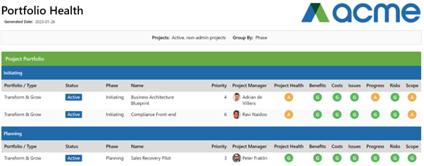 What are the benefits of quality portfolio reporting? Information is provided so that:
- Project governance, status and health can be managed across the entire portfolio
- Corrective action can be taken where necessary
- Demand for new projects can be managed against capacity and budget
- The portfolio can be regularly reviewed to prioritise and potentially reprioritize projects according to strategic goals and when change occurs
How Do We Improve Our Data Quality?
Now this not an open and closed answer. We start by measuring it because you can only improve what’s being measured. Over the years, based on client’s needs, we have developed ways in which different PMOs with varying needs can measure Data Quality, but let’s start with the basics and how PPO comes “out the box”. Then we will move on to examples of how this can be tweaked and evolved for different scenarios.
Health Indicators and Dashboard Comments
Two key elements to communicating the status and progress of a project through reporting are Health Indicators and Dashboard Comments. The commentary is provided by the Project Manager and the audience is typically the Project Owners, Sponsors, and the Project Office.
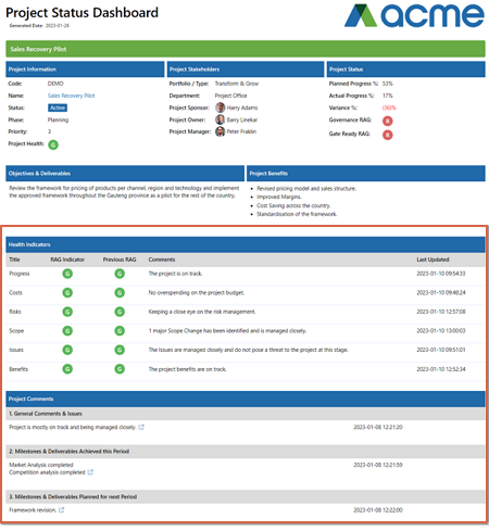 Health Indicators are used to show the status/health of specific areas within the project. Commentary should be given for each indicator to explain the reason for the RAG especially in the case of Amber or Red RAGs. They can be customised to the areas that are important in your PMO and organisation. For example, some PMOs have RAGs for Resources, in the infrastructure environment – indicators on something like Procurement are important. Having a standard set of Health Indicators across projects is important because information needs to be consolidated from various projects for strategic decision making. The standardisation allows your executive audience to focus on the key areas that require their input and attention. For more advice on reporting that people will read, click here.
To further bring about standardisation, guidelines can be added to each Health Indicator to assist the Project Manager in determining the RAG. In this example, for the costs Health Indicator the guidelines tell me as the project manager how to determine my indicator:
The RAG indicator will be Green if the project can be successfully completed with the necessary quality within the approved project budget.
The RAG indicator will be Amber if the project is at risk because the approved project budget will be exceeded BUT the project team has identified and are implementing mitigating actions that have a high chance of succeeding in bringing the project budget back in line.
The RAG indicator will be Red if the project budget will be exceeded. Management intervention is required on the project.

Comments are used to provide written feedback on the status of the project. This is the 2- or 3-line summary of where the project is at and is important in creating context for the other elements of a report.
Comments can also be customised depending on your particular environment and reporting needs. To find out how to change the default Health Indicators and Comments, click here.
To truly realise the benefit of these key elements in project and portfolio reporting – it is imperative that they are updated regularly, at minimum to match the reporting heartbeat of the PMO, at best, as things transpire in the project – much like a sea captain’s log book.
Just like ensuring all items such as RAID logs, schedules and costs are managed and maintained within PPO for real time reporting and visibility it is a must that these Health Indicators and Comments are updated regularly.
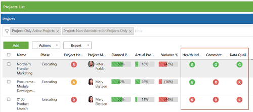
How then can PPO assist the PMO to ensure that updates have been done and that what is currently visible is in fact accurate and up to date? Well, that’s simple – as a base, PPO has indicators per project that ensure that the PMO is aware that Health Indicators and Comments have been updated in the last 7 days – or not.
The indicators are either Red or Green.
If every single Health Indicator has been updated in the last 7 days – the indicator is Green, same for the Comments. If both are Green – then the Data Quality RAG is Green.
If only the Health Indicators have been updated, then Data Quality is red as the Comments are not accurate.
If neither all Comments nor Health Indicators have been updated – it’s all Red.
Data Quality & Reporting Frequency
The reporting heartbeat may vary for different type and sized projects. Strategic, large projects may require more frequent updates than small BAU projects.
It wouldn’t then make sense to keep them on the same Data Quality metric. You might want strategic projects measured on a 7-day cycle and BAU on 30 days for example.
PPO facilitates the need for different reporting frequencies. The calculation can be based on existing fields like type or size, alternately a reporting frequency field can be implemented on the project. This could then be displayed in the Health Indicators and Comments so that the Project Manager is made aware of what is expected.
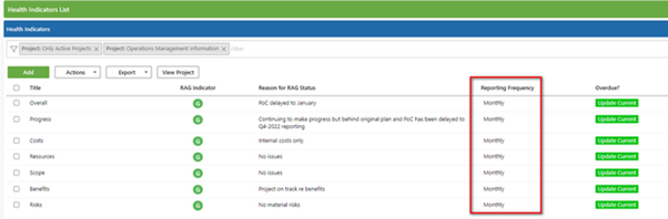
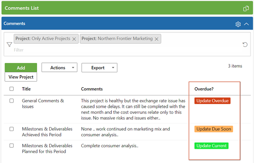
Overdue Indicators
How else can PPO and the PMO help the Project Manager meet compliance?
More and more clients are opting to add an Overdue indicator to Health Indicators and Comments – this assists the Project manager to easily see when an update is due and also to identify one that has been missed when doing updates.
 This and the reporting frequency are easily implemented by adding some calculated fields and color-coded custom lists.
Please contact your Success Manager or the Support desk for assistance to align PPO with your PMO’s reporting requirements.
Coming up in Part 2 – How you can further improve Data Quality with additional metrics and monitoring. Here we will expand on our Data Quality discussion by giving you examples of metrics and monitoring that have been implemented by our clients on their Data Quality journey.