
November is here, and even as the holidays are drawing near, our developers continue to be hard at work designing a new user experience just for you! So this week, we’re bringing changes to the menu layout. Our new, redesigned menu which is cleaner, more intuitive and allows for faster navigation in PPO also boasts an improved mobile experience.

Let’s dive right in and look at each of the elements a bit more closely.
User menu
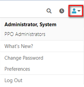
The new user menu, located in the top right hand corner shows you your user name and the user group that you belong to. It also allows you to access options that were previously available as action icons on the left hand side of the home page. These include links that allow to see new features in PPO, access support, change your password, edit your preferences and log out of PPO.
Time entries
![]()
Immediately to the left of the user menu is the link to the time entries page. You can access your time sheet by simply clicking on the icon from anywhere in PPO and not just from the home page. Now that’s convenient!
Search
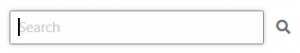
In order to save some space and reduce clutter, we have changed the search box so that it is only visible when you click on the search icon. Below is what it looks like when you’ve clicked on the icon.
Projects menu
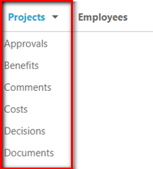
The Projects menu item is where it has always been and you can still access the project list page by clicking on the menu item.
You will also see all the project related items (previously accessed via the the Quick Page Locator) as soon as you hover with your mouse over the menu and can quickly access the various list pages by clicking on one of the items. It is similar to the old Quick Page Locator, but just more conveniently located.
Reporting menu
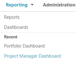
The new reporting menu consolidates the old “Reports” and “Dashboards” menu items.
It will also now conveniently show you reports or dashboards that you’ve recently used. How neat is that!
Administration menu
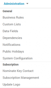 The Administration menu is also where it has always been, but now, when you hover over the menu item, it will show you a list of all the administrative functions that you have access to, conveniently grouped, to allow you to access these functions directly.
As before, access to the Administration menu items is linked to your user group access.
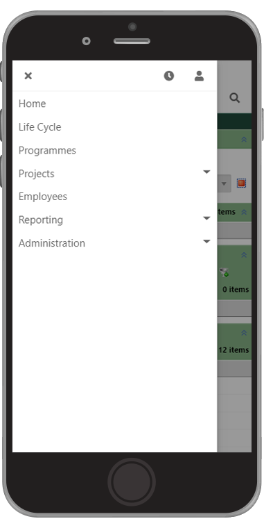
Mobile menu
We have also totally re-designed the menu when using PPO on a mobile phone as shown below. It is now easier than ever to navigate in PPO regardless of your screen size without giving up any functionality.
We understand that these changes will take some getting used to and we’re always interested in feedback, so drop us a line with your thoughts!