
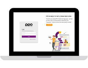
We hope that you love our new login page as much as we do! There is actually more to it than meets the eye and it showcases a lot of the changes that you will start seeing elsewhere in PPO.
Side banner
The most obvious change is the introduction of a side banner which allows us to more effectively communicate. During the user interface refresh project we will use this to update you about upcoming changes.
New font
We have introduced a crisp new font which is slightly larger than our previous font and displays more consistently across different devices.
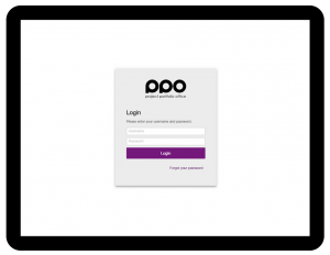
Responsive interface
You will notice that the login page looks a bit different depending on your window size and the device that you are using. Below are screenshots of the login page across different devices:
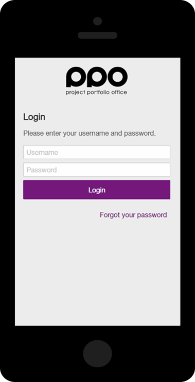
You may notice that on a phone screen, the font sizes are also larger, making it much easier on the eye.
Larger input controls
You will also notice that the text boxes / input controls are slightly bigger, making clicking or tapping on them easier and giving the text a bit more breathing room.
Please let us know what you think!