Drill Through Across Multiple Pages

As a PPO Administrator, you no longer need to open a new administration tab just to navigate to a selected filter or a custom list within a dependency—we’ve streamlined the process to save you a few extra clicks!
As a PPO Administrator, you no longer need to open a new administration tab just to navigate to a selected filter or a custom list within a dependency—we’ve streamlined the process to save you a few extra clicks!
Have you been using the PPO Scheduler to build your project schedule, only to lose your progress because you forgot to hit Submit, got timed out, or accidentally navigated away? It’s frustrating and disruptive—but not anymore!
PPO administrators can now enable or disable multiple report mailers at once—perfect for temporary pauses. Watch this short video to see how!

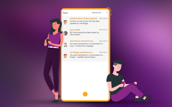
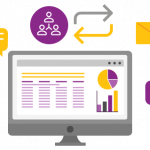
We’ve enhanced PPO’s Feed, making it easier to see changes at a glance and react instantly—saving you time and keeping you connected to your project.
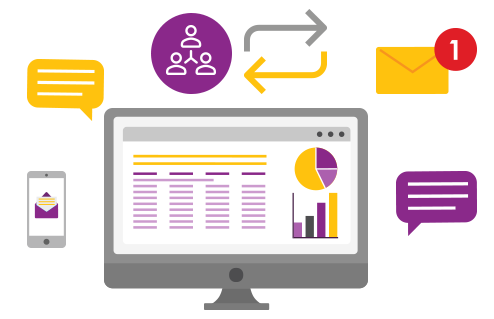
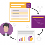
Capturing and managing large datasets just got easier! With a faster, more intuitive interface, you can efficiently add and update data over multiple periods.
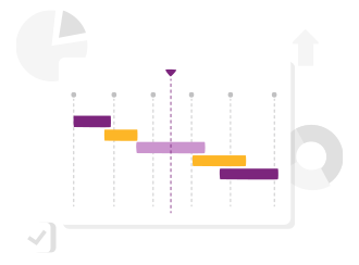
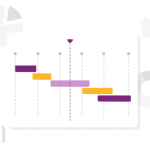
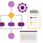
Streamline your project planning with PPO’s built-in Scheduler. From easy drag and drop scheduling, improved Gantt charts to progress roll-ups and real-time calculations, manage everything in one place—no third-party tools needed.

Staying updated with PPO’s enhancements has never been easier. Our Quarterly New Feature Webinar series for 2025 is your way to unlock the full potential of PPO, ensuring you make the most of every new enhancements we deploy.

As another whirlwind year comes to a close, it’s time to reflect on 2024’s milestones. From transformative product enhancements like the customisable home page to the upcoming Scheduler set to revolutionise project planning, this year has been all about growth and innovation. Our quarterly webinars brought clients together to share success stories, while our small but mighty team continued to deliver exceptional results. Here’s a look back at what made 2024 extraordinary and a glimpse into what’s ahead for 2025!
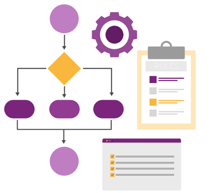
Discover how your organisation can transform recurring initiatives into streamlined, efficient workflows, freeing up time and resources for innovation. With PPO’s Template Projects, even the most unique projects can benefit from the power of structure and standardisation.
Subscription management is a crucial responsibility for PPO Admins, and having a reliable audit trail is essential. That’s why PPO includes a Subscription Management History Report, providing a detailed record of all changes—complete with timestamps and the user who made each update. To make this report even more accessible, we’ve introduced a new enhancement where PPO Admins can now access the Subscription Management History Report directly from the Subscription Management page.