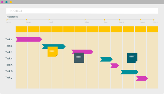
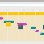
Scheduler – Gantt & PDF Improvements in PPO
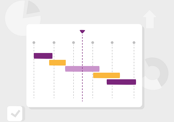
PPO’s latest Scheduler and Gantt enhancements bring more flexibility, cleaner dashboards, and smoother exports. From single-date milestones to improved PDF handling, these updates make planning and reporting more powerful than ever.