Editing your users just got quicker


Now, with our new multi-edit feature, you can update multiple user accounts in one go, making user administration faster and more efficient than ever!
Now, with our new multi-edit feature, you can update multiple user accounts in one go, making user administration faster and more efficient than ever!
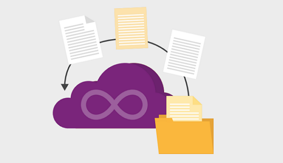
We’ve upgraded the linked documents feature, so now you have the same full set of actions available as in the main document list. This makes it much easier to download all documents linked to a risk, task, issue, or any other item—and you can even save time with a bulk edit these linked documents.

Our latest enhancement introduces an intuitive drill-through feature from key metrics on the homepage directly to detailed views. This feature allows quick access to critical insights—like diving into projects flagged as RED, viewing overdue issues, identifying the highest-severity risks, or checking outstanding work items at a glance.
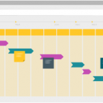
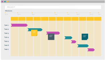
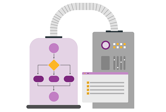
PPO is excited to introduce its own Scheduler which is designed to accommodate all levels of project management maturity. With the PPO Scheduler, you can streamline your processes and eliminate the need for costly third-party tools, reducing both complexity and technology expenses.

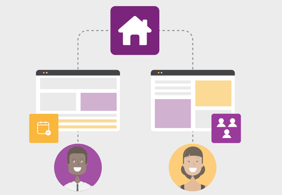
Boost team efficiency with our new home page sharing feature in PPO. Now, users can share customised dashboard tabs with colleagues, allowing team members to adopt pre-built, valuable views without the need to create them from scratch. Learn how this feature can save your team time and enhance collaboration.

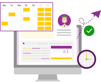
We’ve simplified how PPO calculates resource capacity by removing the System Configuration Planning setting. Going forward, capacity will be determined solely by a resource’s standard hours, making it easier to manage and track. No action is required on your part—your resource records have been updated automatically to align with previous settings, ensuring a smooth transition.

We’re excited to announce an improvement to the widget configuration menu, designed specifically with administrators in mind. This improved menu offers a more intuitive and efficient way to customise widgets, making it easier than ever to manage settings. See how this update can improve your administrative experience!

As we wrap up the final new product feature webinar of the year, we’re thrilled to reflect on the incredible journey we’ve taken together. Over the past months, we’ve introduced a host of exciting new features designed to elevate your experience. This final session provided users with opportunity to assess how these features have been adopted, what’s working, and where we can improve.
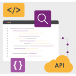
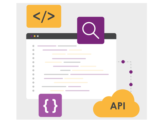
We’re excited to introduce anl enhancement to our existing BI API! You can now access usage data tables directly through the API. This functionality is now immediately available to all clients on your live or evaluation instance.

With our new drag-and-drop feature for the calendar widget, you can easily move events (tasks, issues, risks, etc.) around your calendar with a simple click and drag. Watch the video to see how to update due dates in just seconds!