Author: Lindi Gerber
Lindi, as the Support Manager at PPO, is the heartbeat of the PPO support desk and the sensei to her support ninjas. Lindi loves spending time with her family, catching up on series, shopping , and she is a true wine aficionado.

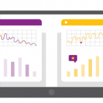
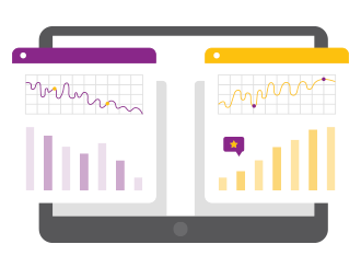
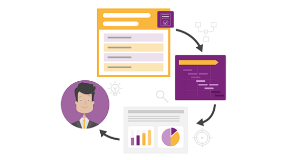
In this PPO Quick Tip, Support Manager Lindi Gerber shares how she uses her custom home page dashboard to run focused, efficient daily stand-ups. With key metrics, interactive board views and clear visibility of sprint progress, she shows how PPO helps her team stay aligned, prioritised and on track.
We’re excited to introduce the latest addition to PPO’s growing library of widgets — the Line Graph Widget! Designed to help you visualise trends and changes over time, the new widget is perfect for tracking metrics like costs and benefits.

With our latest enhancement to the Task Import Wizard, you can now delete all existing tasks in your project with a single click—saving you time and effort.
Have you been using the PPO Scheduler to build your project schedule, only to lose your progress because you forgot to hit Submit, got timed out, or accidentally navigated away? It’s frustrating and disruptive—but not anymore!

PPO administrators can now enable or disable multiple report mailers at once—perfect for temporary pauses. Watch this short video to see how!
Subscription management is a crucial responsibility for PPO Admins, and having a reliable audit trail is essential. That’s why PPO includes a Subscription Management History Report, providing a detailed record of all changes—complete with timestamps and the user who made each update. To make this report even more accessible, we’ve introduced a new enhancement where PPO Admins can now access the Subscription Management History Report directly from the Subscription Management page.

Previously in PPO your donut widgets either had no label or you were able to show the % of each slice of the donut. We’ve improved this to all you to set the following for your Label Display for the donuts:

It’s finally here! Multiple Select Custom Lists has been deployed, and we can’t wait for you to experience it!

We’re thrilled to announce our latest product feature which allows you to apply Color Styling to date fields to highlight whether an item is overdue or due within the next 7 days! This new feature brings visual clarity and efficiency to your project planning and tracking.
In PPO, you’ve always had the ability to delete items from a custom list, but we’ve found that administrators were hesitant to delete the items due to the impacts that it could have on the underlying data, both current and historical data. We have now introduced the ability to mark custom list items as inactive, to avoid some of the pitfalls of the delete option.