
We’re excited to introduce a new enhancement to the PPO bar chart widget that makes your data easier to read and interpret at a glance.
You can now display labels directly on your bar charts — eliminating the need to hover to see values and giving you quicker, clearer insights on your list pages and customised home pages.
Here’s what’s new:
- Label Display Options: Choose between None (default) or Value to show counts directly on each bar.
- Stacked Bar Charts: When using the stacked option, you can now choose None, Value, or Percentage, helping you better understand contribution and distribution.
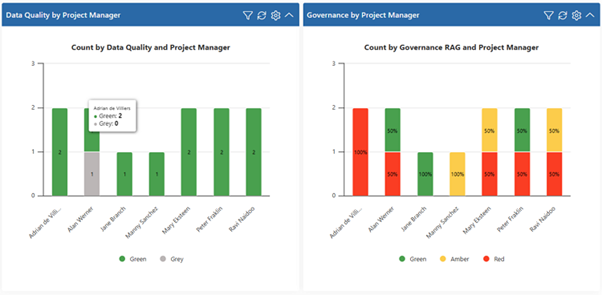
This enhancement improves chart clarity, strengthens visual reporting, and makes your dashboards more informative with less effort.
We do our very best to make PPO better every day, so we’d love to hear your feedback on these latest enhancements.
Don’t forget to let us know if you have any other product enhancement ideas! Drop us an email or log an idea on our community portal please. More importantly, keep up to date with all our new product information by subscribing to our blog.