
A portfolio of projects represents an organisation’s investments (the projects) that they have made, to achieve the planned benefits of these investments, which in turn will deliver on their strategy. The purpose of portfolio reporting is to provide a regular update on how these investments are doing. It’s about sharing the big picture—what’s going well, what’s behind schedule, where the money is going, and what problems might be on the horizon. The goal is to keep decision makers in the loop, make sure the projects are on track, and ensure that by finishing the projects on time, within budget and within the necessary quality that the benefits will be achieved and thus the strategic goals and objectives can be met. Furthermore, by knowing how the current portfolio is performing, organisations will be able to activate projects (make more investments), put projects on hold and sometimes even cancelling projects in favour of other projects that have a high chance of achieving the strategic goals of the organisation.
It’s like being the coach of a sports team and giving a regular rundown of how the entire team is performing. You’re not just focusing on individual players (projects) but on how the whole team is working together and that’s why accurate data is the foundation of effective portfolio status reporting. If the underlying project data is outdated or inaccurate, your project management office (PMO) might end up focusing on the wrong priorities, overlooking risks, or burning through your budget without realising it. To facilitate effective portfolio status reporting, your PMO needs to have the following in place:
Clear Objectives and Metrics
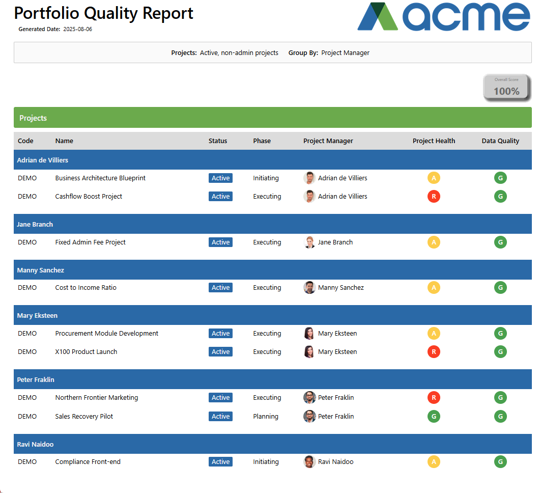
It’s important to define the key performance indicators (KPIs) that matter most, like budget variance, progress variance or portfolio health. PPO’s standard out-of-the-box Portfolio Dashboard provides a view of the portfolio budget, portfolio health and the portfolio timelines. A view of the overall health and status of projects that make up the portfolio is a basic requirement for any portfolio review committee (PRC).
Portfolio Health
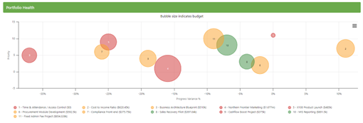
The PPO standard Portfolio Dashboard features a bubble graph that visually represents projects based on their priority and actual progress. Each bubble’s colour signifies the project’s health, while its size reflects the total budget allocated. The graph’s interactive design allows the Executive Committee (Exco) team to explore specific project details. By clicking on a bubble, users can access a comprehensive project status report, offering in-depth insights into the project’s current state.
Portfolio Metrics
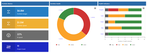
The portfolio budget and spending are vital aspects of any portfolio report. The Portfolio Dashboard in PPO provides metrics that display the total budget, and the percentage spent across all projects. A pie chart offers a visual summary of the projects’ health status in RAG (Red, Amber, Green), with the ability to drill down to specific project names.
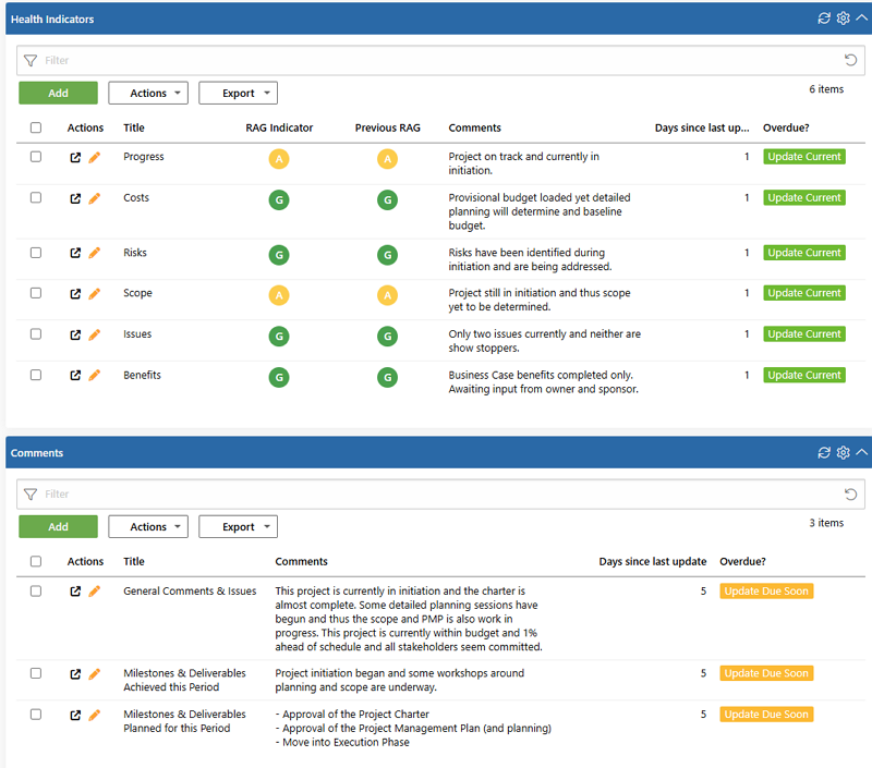
Additionally, the Health Indicators graph reflects the “health status” of individual RAGs that contribute to the overall project health, also with a drill-down option to the project level. Grey indicators, as illustrated below, indicate that two projects have not had their health indicators updated, causing all indicators for these projects to appear as “grey.”
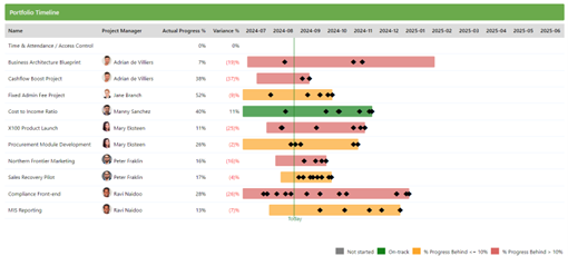
The audience of the portfolio status report want a holistic view of project progress. PPO’s portfolio timeline delivers a comprehensive snapshot of all projects within the portfolio, displaying their progress in relation to their schedules. This timeline allows stakeholders to visualise the planned trajectory of projects over the past month and the upcoming six months, including key milestones outlined in each project’s schedule. The colour coding clearly shows where projects are behind, on track or not started.
Portfolio Schedule & Budget Performance
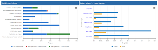
Highlighting discrepancies between budget spend and progress, especially when shown in red, acts as an early warning system. It alerts stakeholders to potential problems, allowing for corrective actions before issues escalate. If the budget is being consumed faster than progress is being made, it could indicate inefficiencies or issues that need addressing. The Quick Project Indicator graph shows the actual progress percentage in relation to the percentage of budget that has been spent. If a larger percentage of the budget has been spent than the percentage actual progress that has been made, the percentage difference will appear in red. If a smaller percentage of the budget has been spent than the percentage actual progress that has been made, the percentage difference will show in green.
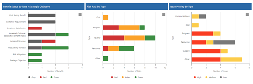
Portfolio Risks and Issues
Risks and issues are key indicators of the overall health of the portfolio. They provide insights into potential threats to the successful delivery of projects within the portfolio and help in assessing whether the portfolio is likely to achieve its objectives. The goal of Highlighting risks and issues is to encourage discussion among stakeholders, fostering collaboration to find solutions and to ensure that everyone is aligned on the potential challenges and the steps being taken to address them.
Centralised and Single Source of Data
The process of manually consolidating data from multiple projects or sources can be challenging, leading to fragmented or incomplete views of the portfolio’s status ultimately impacting decision-making. Another obvious challenge is that collaboration on manual reports can be slow, with delays in receiving feedback and incorporating changes. By the time a manual report is compiled and distributed, the data may no longer reflect the current state of the portfolio, leading to outdated insights. It’s also really difficult to manage how different individuals or teams provide feedback, some might create reports with varying levels of detail and formatting using charts, metrics or percentages while others might provide text commentary, leading to inconsistency and confusion among stakeholders.
Only a robust PPM tool like PPO that can integrate with other systems will facilitate a centralised source for all project and portfolio data. Make sure all project teams use the PPM tool for entering and updating data, creating a single source of the truth. It’s also expected for your environment to make use of other systems (finance, helpdesk, etc.) so the ability for the PPM tool to integrate with other systems is key. PPO enables seamless flow of data between different tools and platforms via our open API.
Standardised and Consistent Reporting Formats
By adopting and automating your portfolio status reports, you’ll be able to maintain a consistent format that enhances decision-making across the organisation. Remember, the portfolio status report is just one input to the executive’s world so make sure you have a standard definition and clearly defined criteria for what RED, AMBER and GREEN (RAG) indicators mean, what % Progress or any other metrics means. More importantly, once you have a standard, get your stakeholders to understand the standards being applied so they are clear on how things are calculated and thus reported on. Once everyone is reporting in the same way and understands the reporting content, portfolio status reports can be automated and sent to the stakeholders ahead of time allowing enough time for stakeholders analyse the data and contribute to meaningful portfolio management discussions.
Regular Reporting Cadence
If the status is not timely or in a format that that your audience understands, it is meaningless! Portfolio status reports should never be erratic and should follow the cycle of PRC meetings. Set a schedule – decide how often you’ll generate these reports (e.g., monthly, bi-monthly or quarterly) and stick to it. This keeps everyone, specifically the project teams on track and ensures timely and relevant updates.
Data Quality Metrics
Data quality is crucial for portfolio status reporting because if the data isn’t accurate, complete, or up to date, the entire report can become useless. Good quality data means your executive team is working with the right numbers and facts, which helps everyone understand where projects stand, spot risks early, and make smart decisions. When the data is solid, you can trust your portfolio status reports to show what’s really happening, keep projects on track, and make sure resources are being used effectively.
PPO’s standard data quality indicators allow the PMO to implement checks and balances to ensure data is accurate and up-to-date. You can also see more metrics like days since last update and whether the updates are Overdue, Due Soon or Not Overdue. Additionally, the PMO can also customise their own views to manage data quality exceptions to streamline data checks for accuracy, and adherence to the standard reporting cycle.
While manual template-based portfolio status reports can be effective in small-scale or less complex PMO environments, as portfolios grow in size and complexity, the limitations and risks of manual reporting become more pronounced, often leading to inefficiencies, inaccuracies, and missed opportunities for strategic portfolio management. Another issue is that paper based portfolio status reports don’t give you real-time insights. They’re just static snapshots, that lack the interactive elements that automated PPM tools can provide, such as drill-downs, which means you might miss trends or important patterns. And let’s be honest, collaborating on these can be a pain. Sharing and updating versions can lead to a flood of unnecessary emails and cause confusion, while customising the report for different stakeholders presents an entirely different challenge.
Implementing PPO for portfolio reporting is easy, you don’t need high maturity or detailed end to end portfolio management processes. If your PMO is still relying on static snapshots without the ability to compare performance, now’s the time to ditch the paper and automate your portfolio status reports in PPO! Speak to your Success Manager to save time, reduce errors, and gain real-time insights that drive better decision-making today!