Author: Tarryn-Leigh Frans
Tarryn-Leigh is the Marketing Manager at PPO. She is enthusiastic about business improvement and is keen to share information and influence change. In her free time, she loves traveling, reading, and spending time with her husband and dogs.
The Key Metric Widget just got smarter! You can now perform simple arithmetic — like adding, subtracting, multiplying, dividing, or calculating percentages — directly within the widget. It’s simple enough for any user to create their own.

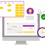
In this PPO Quick Tip, our consultant demonstrates how he uses key metrics to manage his sprint. By tracking the total estimated hours and the estimate to complete, he can instantly see team capacity, identify potential delays, and communicate when sprint items may be missed. See how PPO’s key metrics make agile sprint management simpler and more transparent.
PPO’s History Reports have been enhanced with a consistent, modern look and the flexibility to choose which fields you want to track changes for. These updates provide a clearer, more customisable view of how items evolve over time.
In this PPO Quick Tip video, our technical support consultant shares four simple ways to speed up your time entries — from pinning repetitive activities to navigating previous weeks with ease.

Our latest new feature product webinar gave attendees a hands-on look at PPO’s latest updates, including the new Side Panel, Multiple Resource Assignment, and fresh Scheduler enhancements. The session also featured a client spotlight from the University of the Western Cape, where Andre Redlinghuis shared how their PMO is improving project prioritisation to ensure the right initiatives get the right focus at the right time.

The Grid Widget just got more flexible! You can now use the Year and Month custom list fields period type even if your data only includes a Year field. Perfect for cases like managing annual budgets or other yearly data, this enhancement makes setup simpler and keeps reporting aligned with how you work.
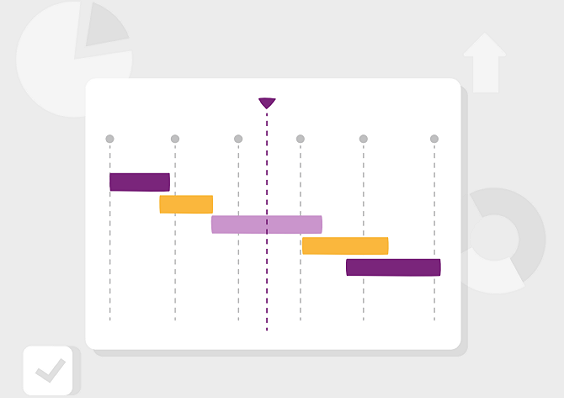
PPO’s latest Scheduler and Gantt enhancements bring more flexibility, cleaner dashboards, and smoother exports. From single-date milestones to improved PDF handling, these updates make planning and reporting more powerful than ever.

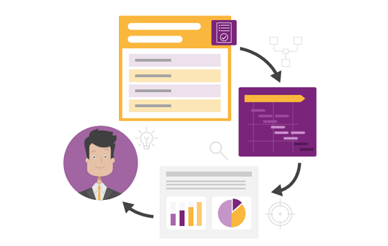
In this quick tip, our support consultant shows how the copy functionality helps you duplicate single or multiple records in seconds. From adding new sprints to creating multiple planned work items, see how this simple feature can save you time
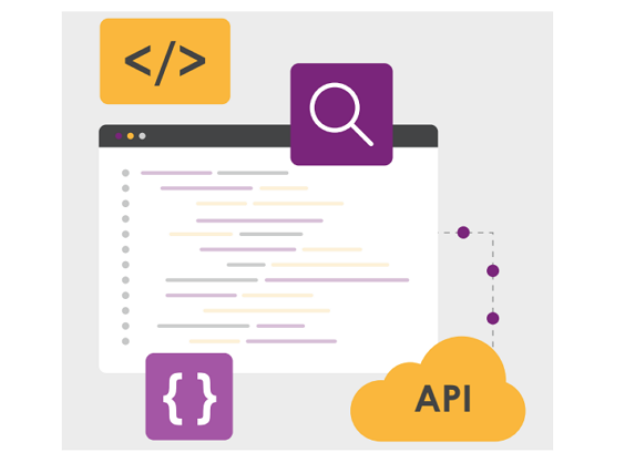
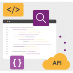
We’ve made it easier for you to track your Business Intelligence (BI) exports! Based on your feedback, we’ve introduced a new Export Log entity within the BI API. This enhancement gives you clear visibility into when exports are completed, including the exact timestamp, entity name, and number of records exported.

PPO’s long-awaited Multiple Resource Assignment feature is here! You can now assign multiple team members to a single task, risk, issue, action, or stakeholder role – eliminating the need for duplication and making collaboration far simpler. Much like the Multiple Select Custom Lists rollout, this feature is available to all clients, but PPO Administrators can decide where to enable it by converting existing single-select resource fields.