Author: Tarryn-Leigh Frans
Tarryn-Leigh is the Marketing Manager at PPO. She is enthusiastic about business improvement and is keen to share information and influence change. In her free time, she loves traveling, reading, and spending time with her husband and dogs.

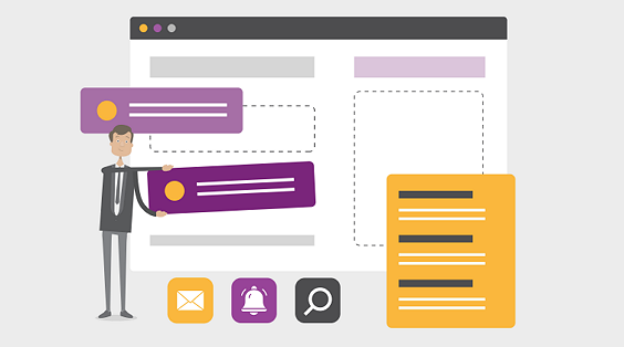
PPO’s External Form capability allows organisations to capture information from non-PPO users without requiring system access or custom integrations. Learn how the new security enhancements and configuration options make it easier to manage and maintain these forms directly within PPO.

Missed the March PPO Product Webinar? Here’s a quick recap of the latest home page enhancements, scheduler improvements, and external form capabilities now available in PPO.
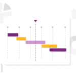
The latest Scheduler enhancements are designed to make planning faster and easier. New tasks now default to smarter start dates, so schedules build in a logical sequence with fewer manual adjustments. Gantt chart exports are clearer with automatic project headers, and a new bulk editing option lets you update multiple tasks — like responsibility, duration, or progress — in a single step. Small changes that make managing project schedules far more efficient.

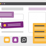
We’ve added a small but powerful enhancement to Conversations in PPO. A new “Type @name to tag” prompt now appears in the comment box, making it clear how to involve the right colleagues in a discussion.
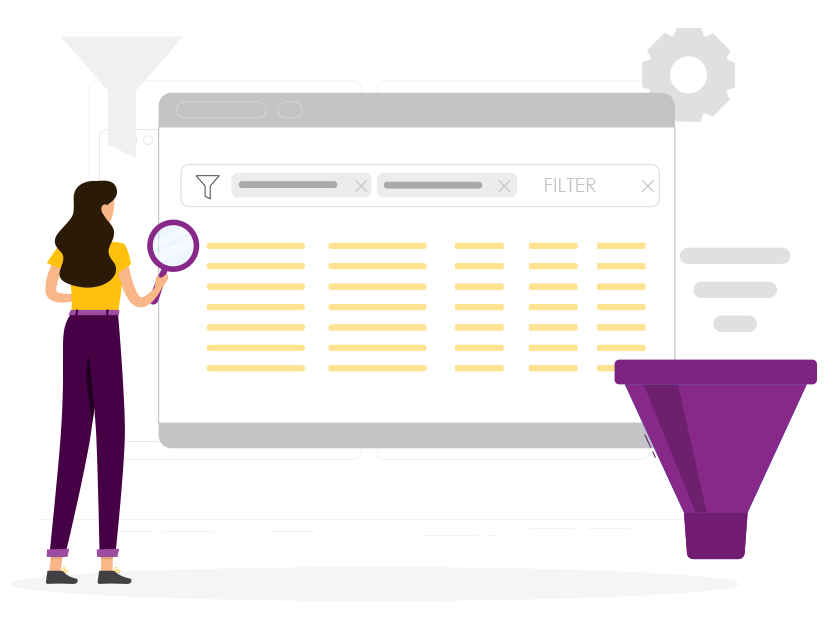
PPO’s List Widget now includes Group By, allowing you to organise and structure data directly within your entity list pages. Instead of relying on reports or dashboards for grouped views, you can now group information such as projects, risks, or demand using the same familiar list controls.
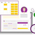
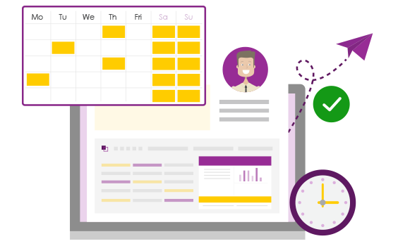
Time is now fully integrated into your customised PPO Home Pages. Add Time Entries and Time Entry Summary data to your personal dashboards to track utilisation, identify missing time, and review detailed summaries — all from one central view.
In this PPO Quick Tip, we explore how the Calendar Widget can be used to plan and communicate upcoming feature deployments. By surfacing key dates in a simple weekly or monthly view, teams can align blog content, newsletters, and release timelines — ensuring nothing is missed and everyone stays informed.

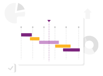
We’ve introduced the new Planning Gantt, a standard dashboard that provides clear visibility into resource allocations across projects and time, helping teams assess new demand, plan for peak periods, and balance workloads in line with business priorities.

PPO’s bar chart widget now includes label display options, making charts easier to read without hovering. Choose to show values on standard bars, or values and percentages on stacked charts for clearer, more insightful visual reporting.

PPO’s 2025 webinar series delivered some of our biggest advancements yet — from the launch of the new Scheduler and multiple resource assignments to the introduction of the side panel and In-Line Editing. Each quarter also featured real-world insights from clients like Momentum, Certa Ireland, UWC, and Nedbank Private Wealth. As we look ahead, the 2026 webinar calendar is now live. Explore the full wrap-up and register for next year’s sessions.