The improved filtering, column drag and drop on list pages and the interactive Gantt view marks the introduction of the first PPO widget. It’s the start of a fundamental shift away from the silo approach of working in PPO and with the move to more widgets in the upcoming months, you can expect more integrated and customisable views. The future starts today with:
General Usability Improvements – The biggest change in behaviour is that there are no page reloads when working with list pages which improves the user experience. A spinner icon is displayed while the data is being loaded. No more waiting to apply your filters!
Standardised Formatting – This includes centre aligned column headings for RAG Indicator fields and right aligned column headings on numeric fields. At face value, these changes seem really simple, but they’re necessary as they lay the foundation for what’s to come…
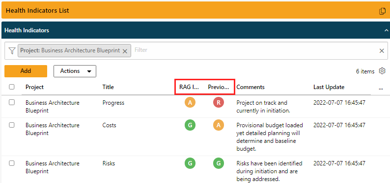
Right Aligned Column Headings with Centre Aligned Health Indicators (Old)
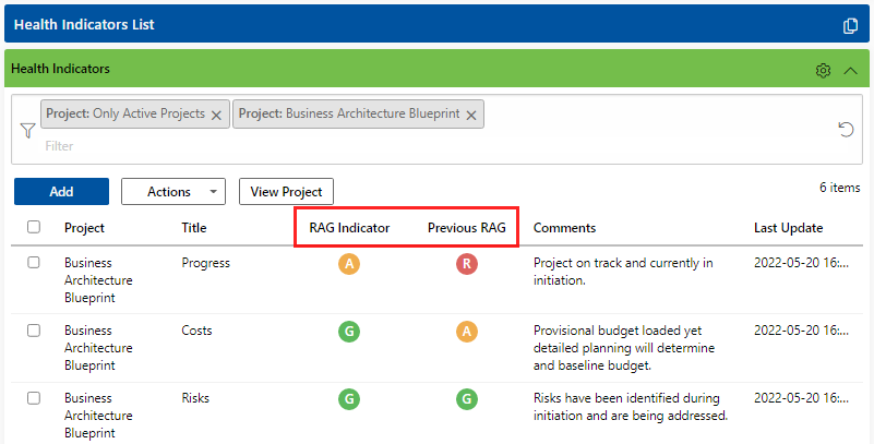
Centre Aligned Health Indicator Column Headings (New)
Left Aligned Column Headings with Right Aligned Values on Numeric Fields (Old)
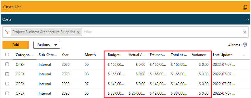
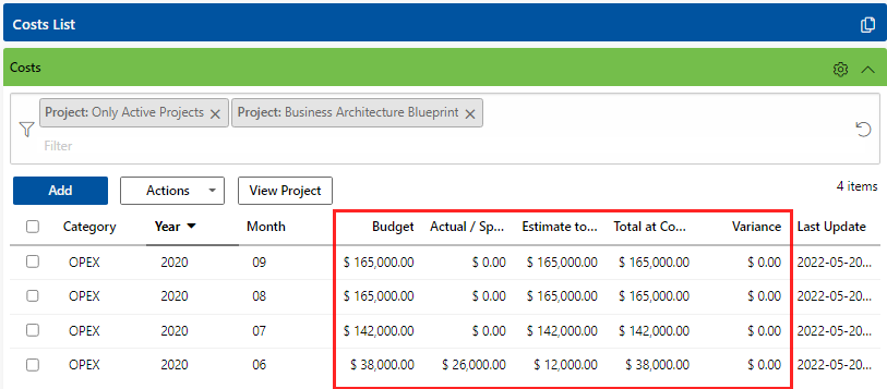
Right Aligned Column Headings on Numeric Fields (New)
Working with List Pages & Gear Icon – Cue…Gear Icon. Now, this is one to really get excited about. The new gear icon introduces drag and drop on column headings and gives users the flexibility to order their columns and easily restore defaults with the click of a button. If you’re curious about the other enhancements related to working with list pages, check out this short video:
Filter Icons, Controls & Action Buttons – The first thing you’ll notice is the new filter controls and icons. I’ve always struggled to distinguish between Personal, Global and Shared filters. That’s a thing of the past with the new filter icons. You’ll also see changes to working with filters on list pages and the use of the Actions buttons. Check out the short video to see these changes…
And that brings us to our final enhancement, Interactive Gantt Chart view. The new and improved Gantt View allows users to:
- Import Tasks directly from the Gantt View
- View single or multiple projects in a Gantt view
- Zoom in and out buttons have been replaced with a slider that changes the time scale
- The Gantt is split down the middle with a moveable line for flexible viewing with the ability to manage columns for both the Gantt and the List View
Wait, there’s more but check out the short video to see the new Gantt View:
Many enhancements just like this one come directly from user feedback. What improvements do you want us to make to PPO? Log your idea on the Community Portal.
We do our very best to make PPO better each and every day, so we’d love to hear your feedback on this latest enhancement.